The making of shltr
Design Question
How might we reduce the loneliness felt while waiting at the bus stop?
Precedents
We began by looking into uses of AR in the transportation industry. Our research brought us to two conclusions. First, there was an opportunity to provide an engaging experience to a person waiting for transportation. Second, transportation was used to help people find their way around a city, but we could look more closely into whether it could be used to help people find their place in the city.
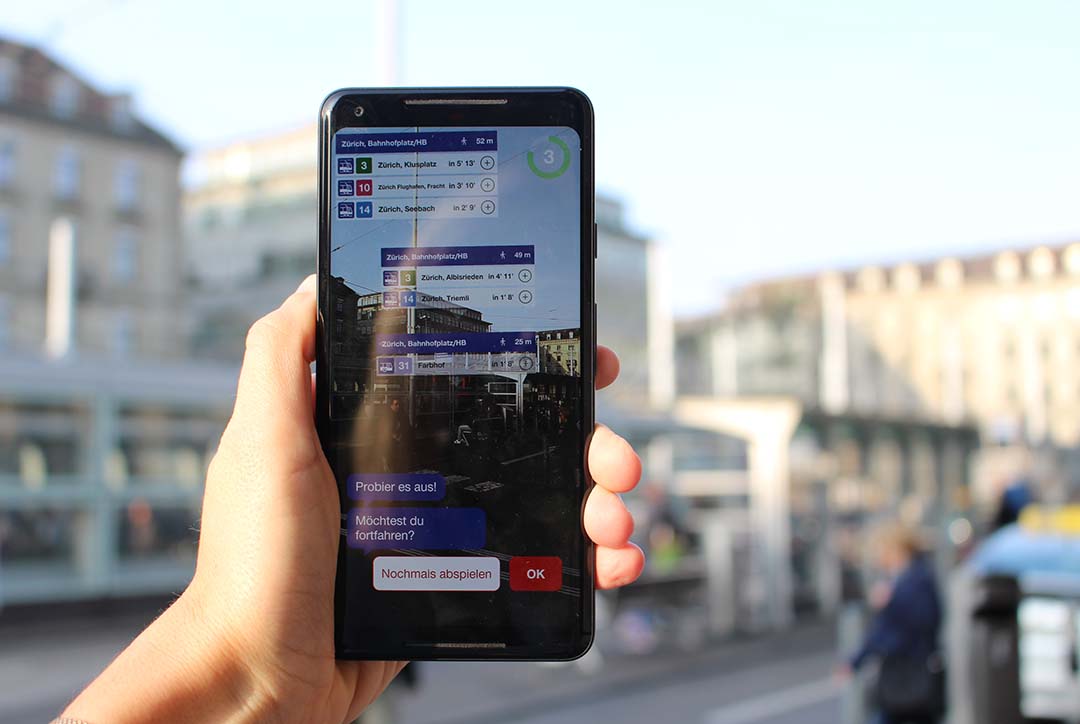
This mobile app by Swiss Federal Railways was developed to improve navigation around Zürich Main Station. Using ARCore, the app augments real-time updates and schedules over signs to help the user orient themselves in the station.
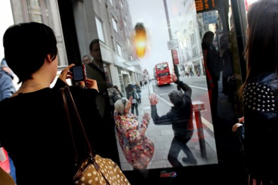
Pepsi Max developed an interactive marketing campaign using augmented reality, depth mapping, and 3D assets to composite extraordinary scenarios into a London bus shelter’s view of the street. This added a memorable, ‘unbelievable’ moment to commuters’ day.
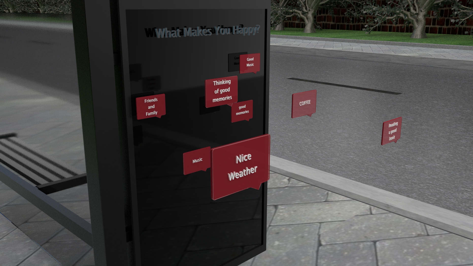
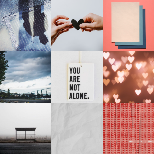
Loneliness
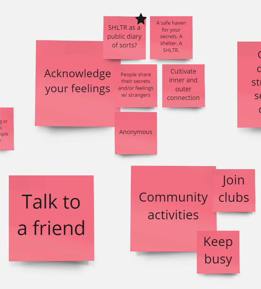
We also thought a lot about how to actually alleviate loneliness. In our research, we found that loneliness could be reduced by simply acknowledging it, and one way to do this was to write down your feelings in a diary. It was this that gave us the idea of transforming the physical bus shelter into a virtual public diary that allowed commuters to share their feelings.
Visual Identity
With this in mind, we began to develop some of the brand's visual components. We picked two main colours, red and blue, red to represent the warmth we were trying to generate, and blue to represent the loneliness we were trying to alleviate.

Prototypes
We made several prototypes throughout the term that helped us narrow down the type of experience we wanted to create.
Our first prototype helped us realize that we were missing some needed interaction, so we came up with the idea of having the user tap their screen to place their note.
Even with the tap to place, we still wanted to make our experience a bit more dynamic, so we decided to add some depth to the notes instead of having them flat against the shelter. Users would also be able to set the depth of their note as well.